
One decision at a time
Every extra choice slows people down. I split complex setup into short steps and lead each screen with the one thing that matters.
In SOCIO: onboarding asks one question per step, and the dashboard leads with a single number.
UX/UI Designer · Psychology graduate
I'm Mehwish, a UX/UI designer with 4+ years of product work for teams in Germany, the UAE and the US. My degree in psychology shapes how I design: fewer decisions per screen, clear feedback, and interfaces people can trust.
Three products, each designed end to end: a live web app from my time at Vita Software, a mobile app with its own design system, and a shopping app where I created the brand too.
Client portal and studio admin
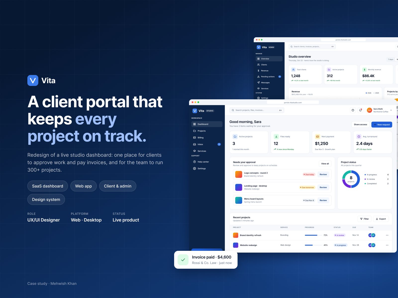
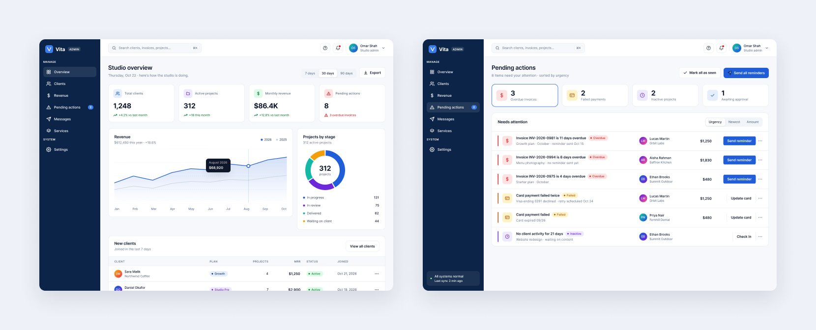
Clients follow projects, approve work and pay invoices; the studio team runs the operation from one admin view.
AI social media manager
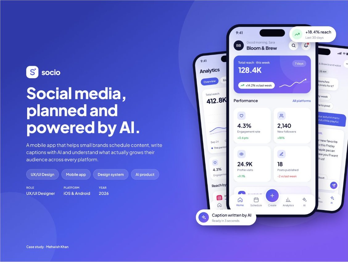
Plan, write, schedule and measure posts for every platform, with AI that helps at the moment of decision. 34 screens on a 24-component system.
Handbag shopping app
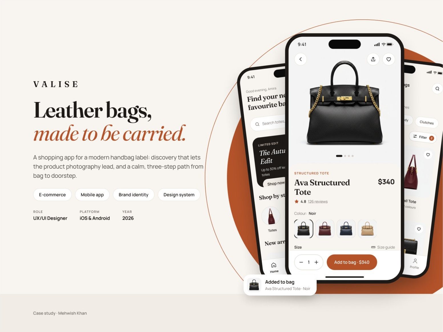
A calm, editorial shopping experience for a small-batch leather label, with the brand and the product designed together.
About
I started designing interfaces in 2022, while I was studying psychology at NUML in Islamabad. The two have shaped each other ever since.
Psychology taught me how people notice, decide and come to trust something. Design gave me a way to use that every day: in the order of a screen, the words on a button, and what a product asks of someone before it gives anything back.
Since then I've designed web apps, mobile apps, websites and design systems for teams in the US, the UAE and Germany, working closely with developers to get them built. I start every project with the same two questions: what does this person need to do next, and what is getting in their way?
I studied how people perceive, decide and feel before I designed for them. These ideas show up in my work every day.
Every extra choice slows people down. I split complex setup into short steps and lead each screen with the one thing that matters.
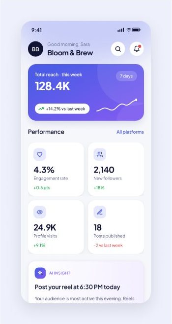
In SOCIO: onboarding asks one question per step, and the dashboard leads with a single number.
People trust tools they can predict. When software acts for them, they should see it, and be able to change it.
In SOCIO: violet marks everything the AI suggests; nothing posts without the user's approval.
Attention is limited, so the interface should spend it for the user: urgent items first, everything else calmly behind.
In Vita: clients open to items awaiting approval; admins get a queue sorted by urgency.
Four years designing interfaces, prototypes and design systems with developers and stakeholders across time zones.
Education
National University of Modern Languages (NUML), Islamabad · 2021–2024
Research project: the impact of personality traits and life satisfaction on academic performance among university students.
Tools
Skills
Zirve Software and Marketing Agency
Designed user-centred interfaces and visual assets for software and marketing projects, working with stakeholders and developers to turn requirements into clear, accessible experiences.
Vita Software · Germany
Designed the Vita client portal and admin end to end: interfaces, prototypes and assets, refined through research, observation and feedback with developers.
7D Consulting · Dubai, UAE
Designed websites and mobile apps for international clients, from wireframes and prototypes to design systems, and supported developers through implementation.
Superior Technology Group · USA
Designed interfaces and digital experiences for software and technology projects through prototyping and iteration.
Contact
I'm looking for a UX/UI or product design role, remote or in Islamabad. I usually reply within a day.
Live product · Web app
A client portal where a creative studio's clients follow projects, approve work and pay invoices, and an admin side where the team runs the whole operation.
Tap any image to see it full size.
Problem
Before Vita, the studio managed client work through email threads and spreadsheets. Clients didn't know what needed their attention, and the team spent time chasing approvals and late payments.
What I designed
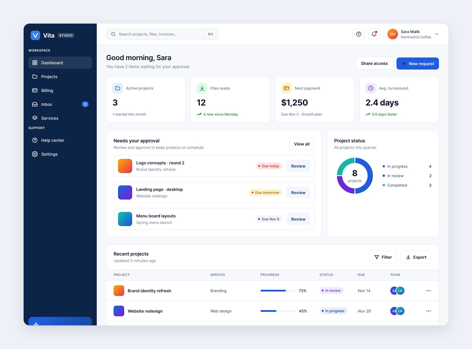
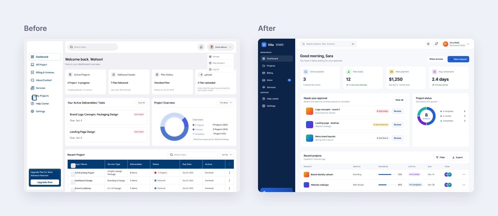
Clients get a dashboard, project board, billing, file delivery and an inbox. The studio team gets an overview, client list, revenue and a pending-actions queue. Both run on the same data, so a status means the same thing on either side.
I designed the product from scratch, including sign-up, password recovery, empty states and settings.
Decisions
The client dashboard opens with items awaiting approval, each with a due date and a review button. Clients come to do something, not to read numbers.
Green means done or paid, amber waiting, red overdue, violet in review. The same badge appears in boards, tables and invoices for clients and admins.
Overdue invoices, failed payments and inactive projects are sorted by urgency, each with one next step: send a reminder, update a card, check in.
Soft headers, hairline rows, tabular numbers and right-aligned amounts make columns of money easy to compare.
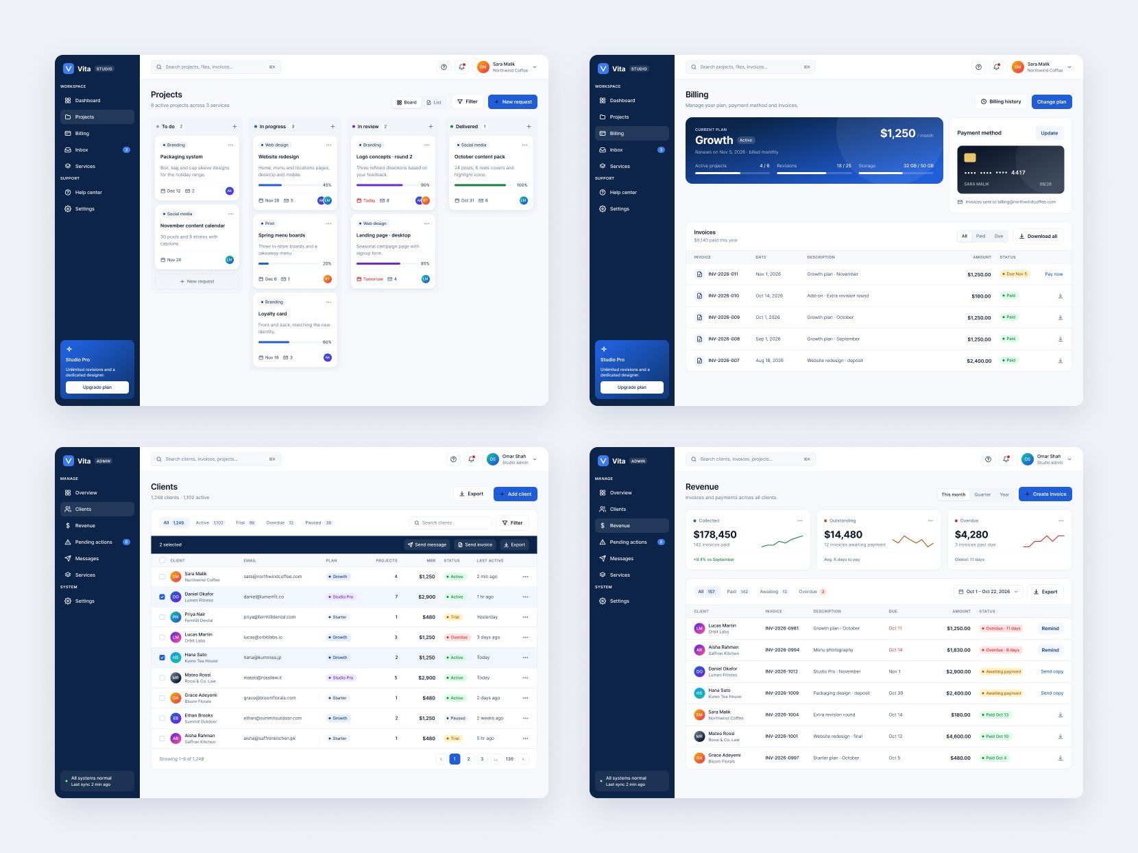
Polish pass
The shipped version had tiny text and three fonts. For this portfolio I re-polished eight key screens on a cleaner system and kept the before and after side by side.
Company website
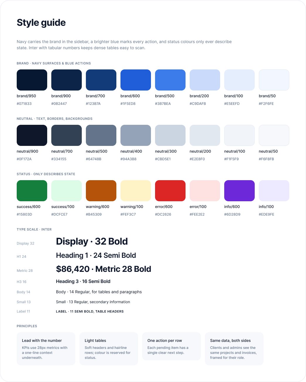
Alongside the product, I designed Vita Software's marketing website in Adobe XD: 12 desktop pages covering home, about, services, four service detail pages, careers, contact and privacy policy.
Its job was to explain a broad set of services to small businesses and turn visits into enquiries, so every service page ends in the same short contact form. Working on both the website and the dashboard meant I designed the whole journey, from the first visit to the client portal.
Designed in 2024; not launched.
Learned
Designing both sides at once forced every status, label and number to mean the same thing to a client and an admin. That discipline is now how I start any multi-role product.
Next project
Concept project · Mobile app · Design system
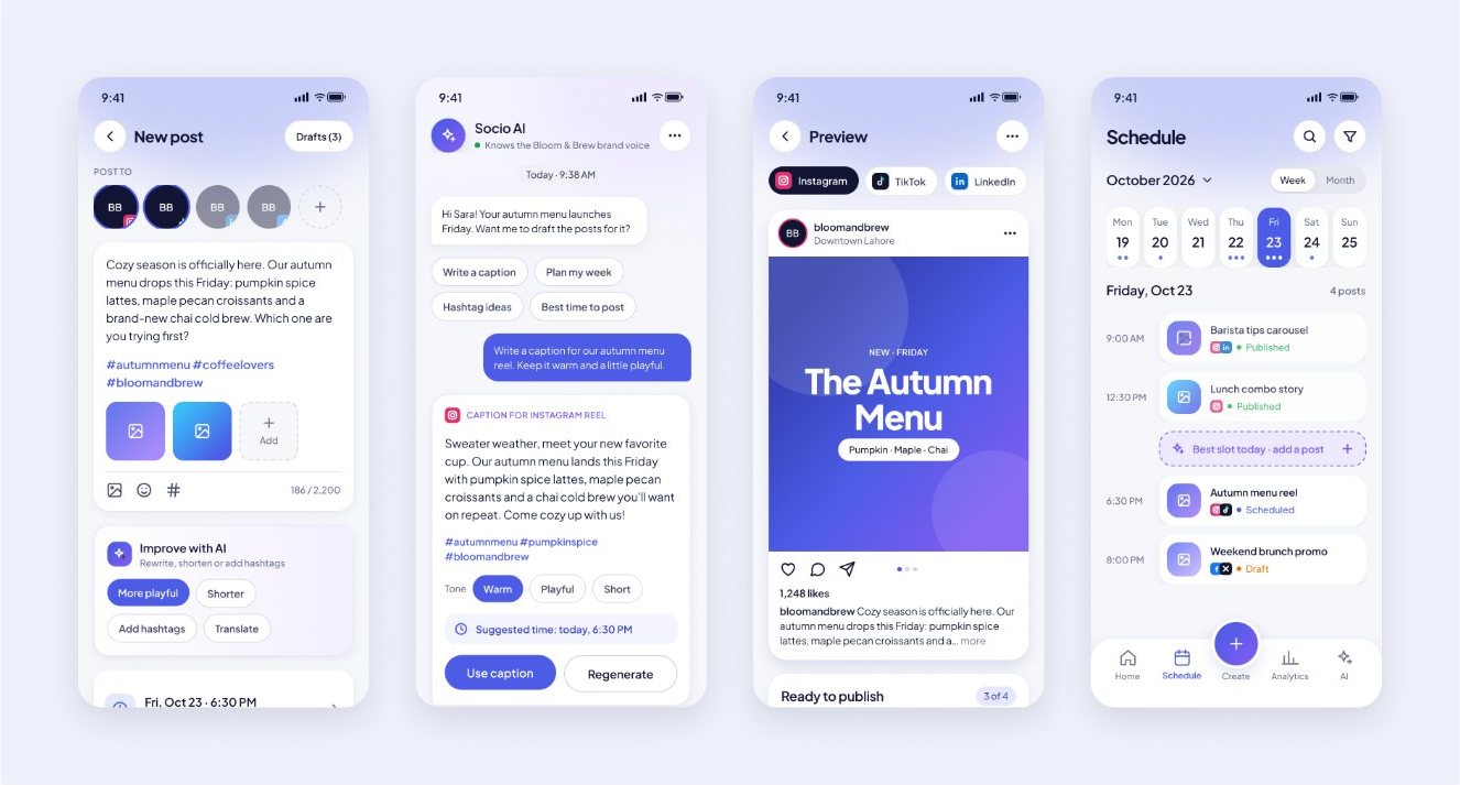
A mobile app that helps small brands plan, write, schedule and measure posts for every platform, with AI that helps at the moment of decision.
Tap any image to see it full size.
Problem
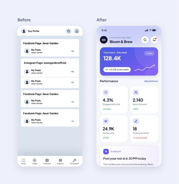
Small brands use one app to schedule, another to write captions and a third for analytics. The original screens of this project also had 8–10px text, three fonts and prices that disagreed between screens.
Every screen follows one persona: Sara, who runs social media for a café called Bloom & Brew, a fictional brand that keeps the content realistic.
Decisions
One hero metric, four KPI cards and the next scheduled posts, so a busy owner gets the answer in seconds.
Best-time suggestions on the schedule, caption help in the composer and a chat assistant, never a separate app to open.
Users always see what the AI suggested and what they did. Every suggestion can be accepted, edited or ignored.
A month grid on a phone is too small to show posts. A week strip and timeline show what goes out today; the month is one tap away.
The preview flags missing alt text and caption length before anything goes live, preventing mistakes instead of reporting them.
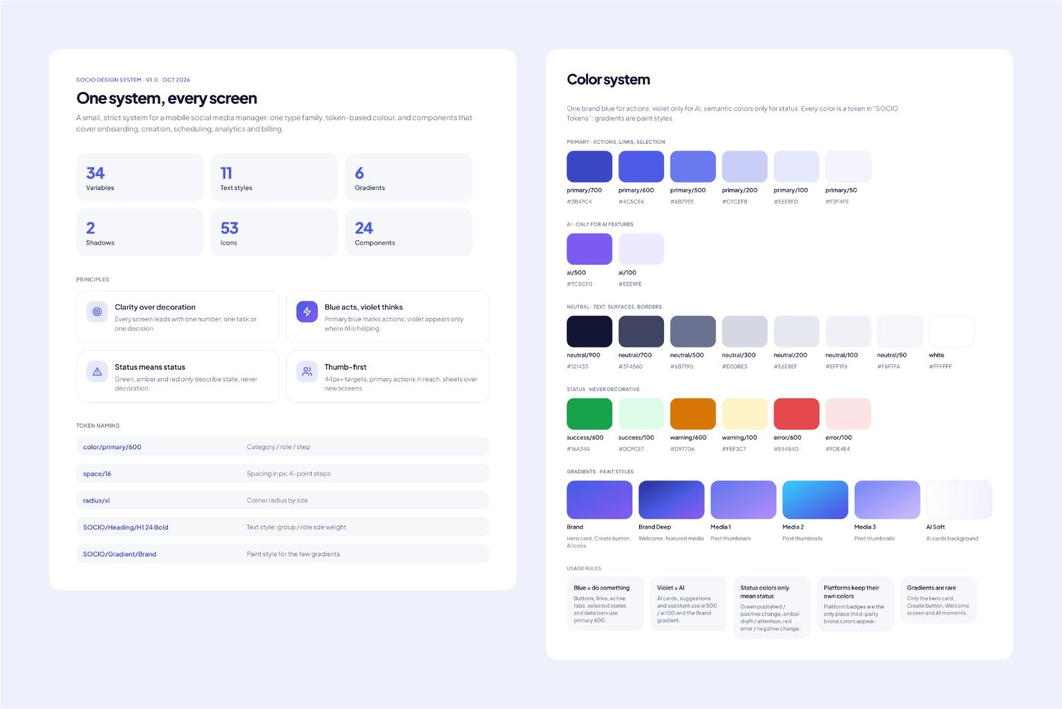
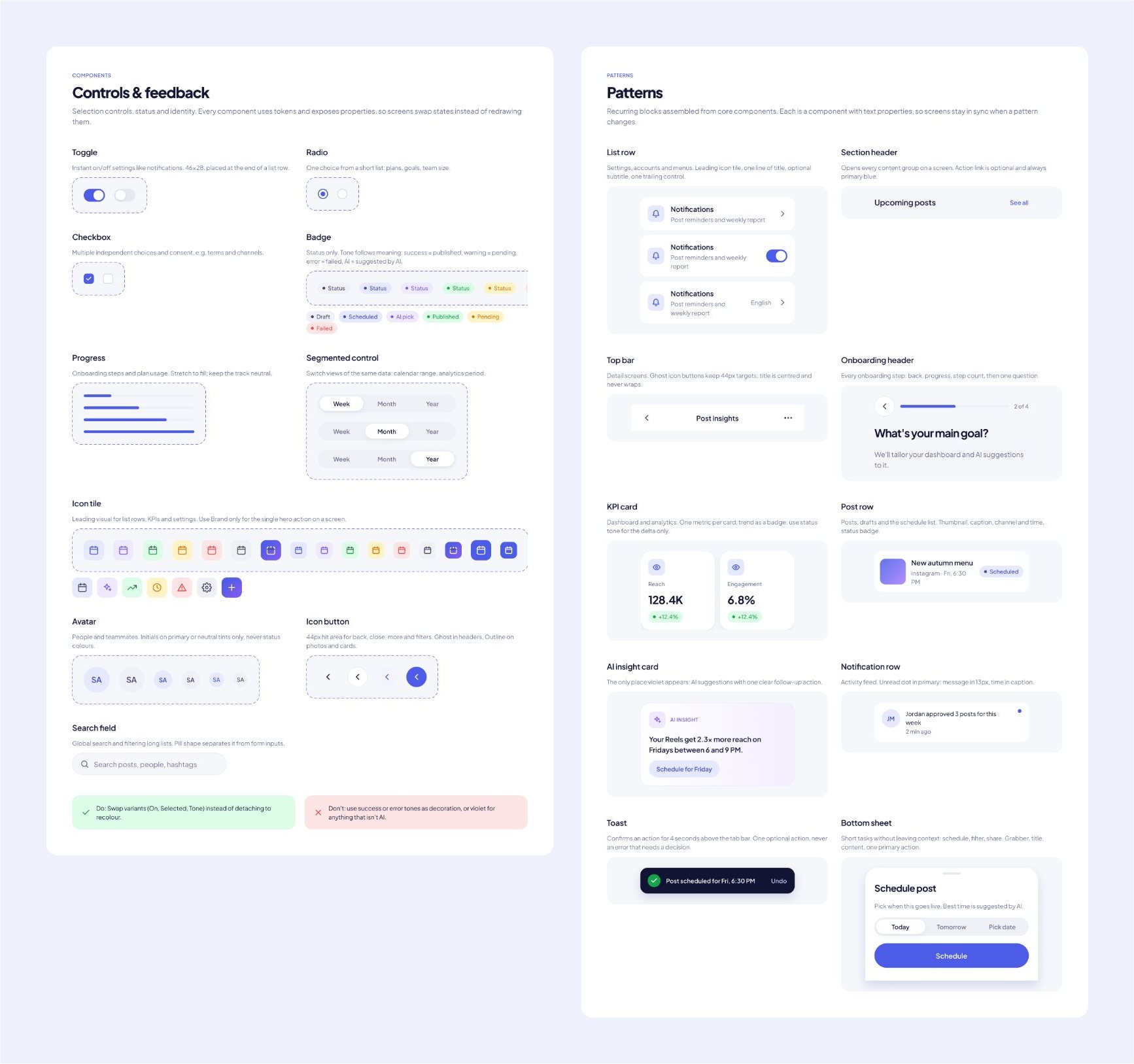
Design system
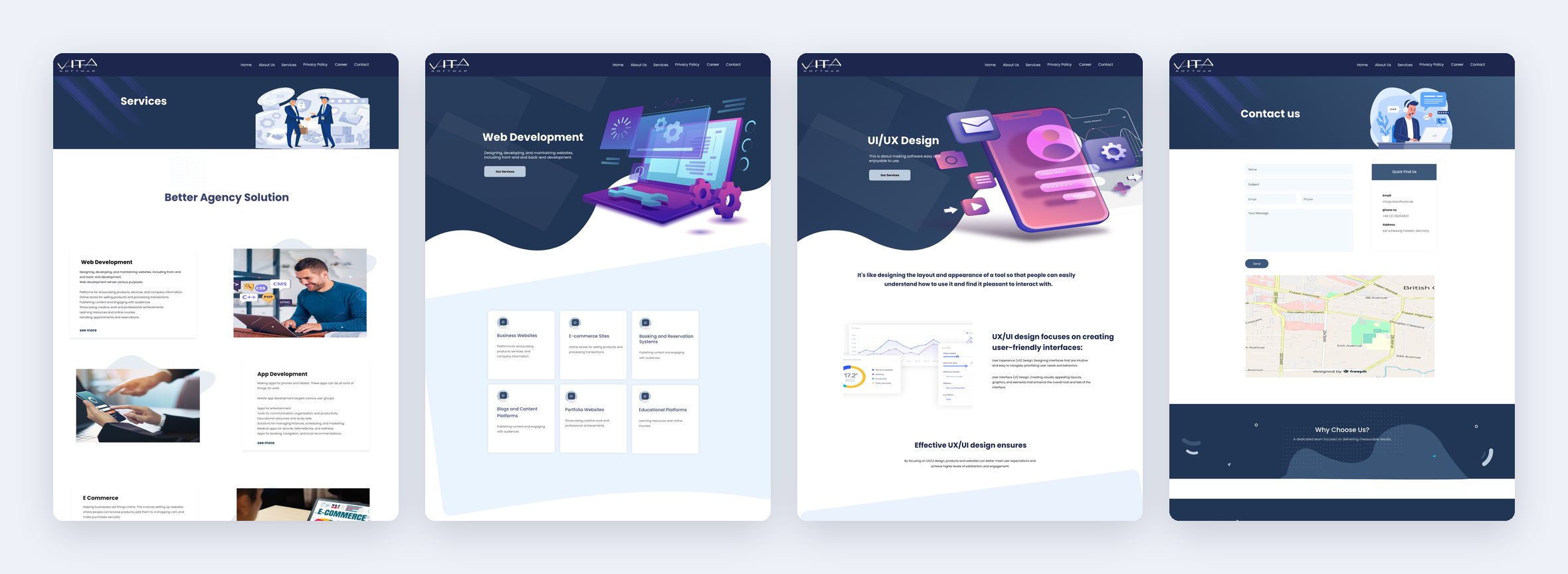
I documented a design system in Figma and rebuilt every screen from it. Blue means action, violet means AI, and green, amber and red only ever describe status.
Screens
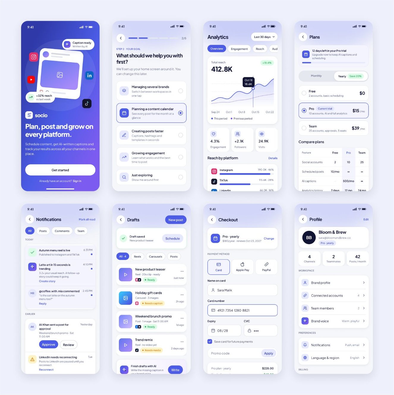
34 screens cover onboarding, posting and scheduling, analytics, plans and checkout, notifications, settings and help.
Next
SOCIO is a concept project and hasn't been tested with users yet. The next step is a usability test with five small-business owners, starting with the AI caption flow: do they trust the suggestions, and how much do they edit them?
Next project
Concept project · Brand · Mobile app
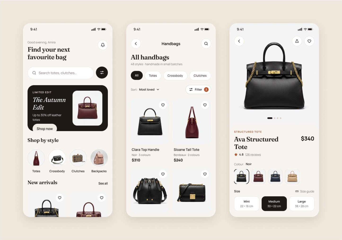
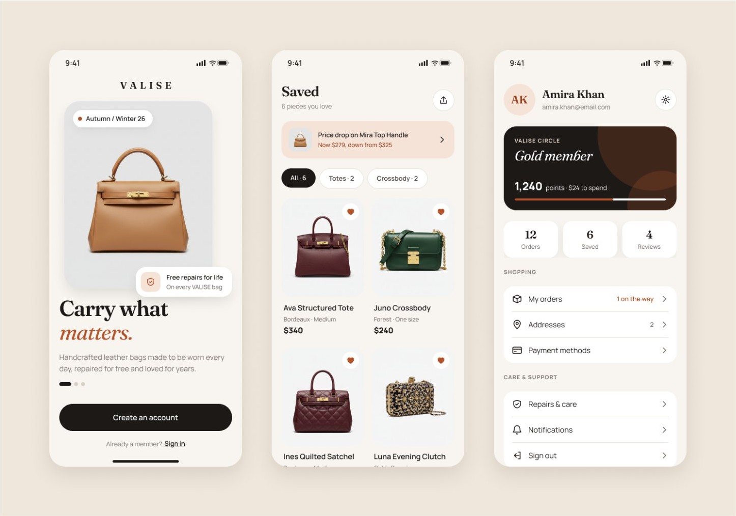
A calm, editorial shopping app for a small-batch leather handbag label, with the brand and the product experience designed together.
Tap any image to see it full size.
Problem
Most fashion apps look the same: busy grids, sale banners and delivery costs hidden until the last step. For a premium brand that sells on craft and longevity, that noise works against the product.
Brand
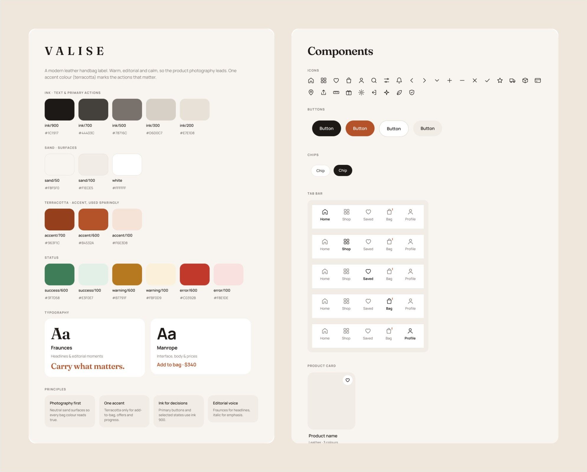
VALISE pairs Fraunces, an editorial serif, for headlines with Manrope for prices and interface text. The palette is ink, sand and a single terracotta accent, used only for add-to-bag, offers and progress, so the eye goes straight to the action.
Decisions
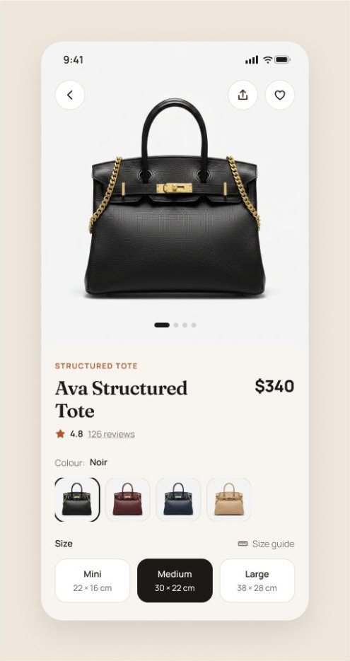
Neutral sand surfaces and large image cards let each leather colour read true. The interface steps back.
Colours taken from the photos and dimensions like "30 × 22 cm" answer the two big questions of buying a bag online.
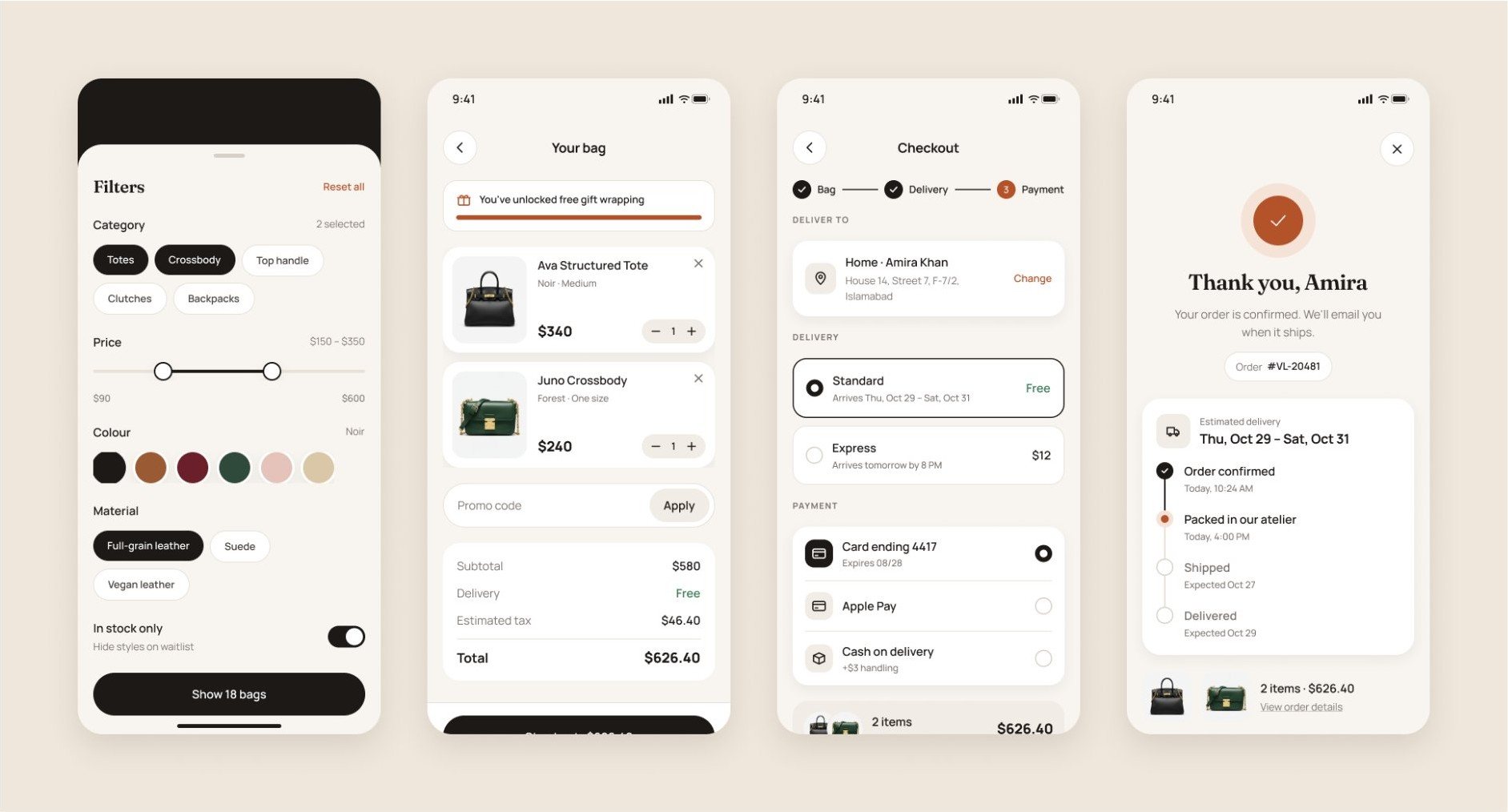
All filters live in one thumb-reachable sheet, and the button states the result: "Show 18 bags".
Delivery and tax show up front, three clear steps follow, and confirmation turns into live order tracking.
Note
VALISE began as a study of a shopping UI kit. I then created an original brand and rebuilt the experience around it; the identity, visual system and design decisions are my own.
Next project